CONTENT & PRODUCT DESIGN
Restructuring the website to optimize conversion
Growing up on the North Shore of Massachusetts, I am a seafood lover! When I was visiting my hometown of Marblehead, MA, I of course had to order my favorite lobster roll. But when I went online to see what else I should get, I found Little Harbor's website to. be not super intuitive and user-friendly. I reached out to the local business to offer my UX expertise, and they were so excited to get started on this project!
Questions
How can we restructure the interface to ensure a satisfying user-experience? How can we integrate product visuals but keep a clean look and feel of the interface? What can we do to promote the pre-made food options that change everyday?
Solution
By researching and strategizing characteristics of financial products on the market, I came up with the following: implementing both tracking and transactions, monthly overviews that are automatically generated with the connection of bank accounts, the ability to set and track goals, and various resources giving users an insight into what it means and how to invest in the stock market.
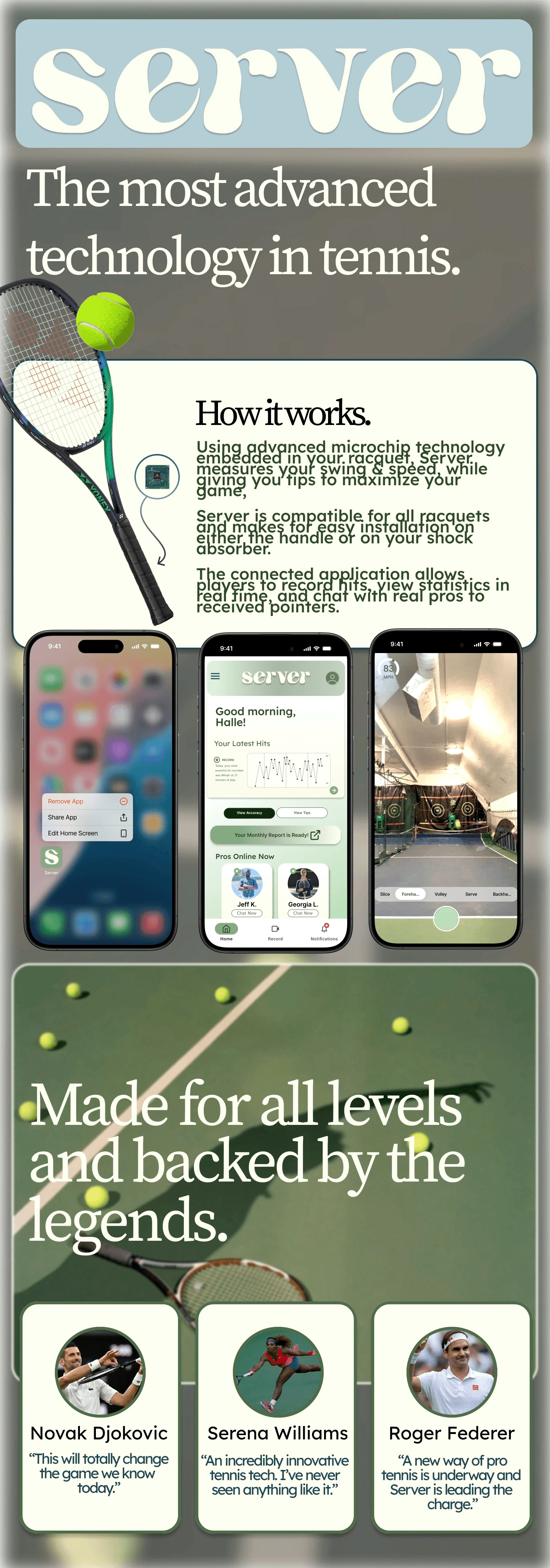
As an avid tennis player myself, constantly looking to improve my game, I knew exactly what kind og technology I wanted to create as there's much more to a powerful, accurate swing or hit than just the players form and strength.
Research & Planning
Conducted market research to identify similar wearable technology challenges and user preferences. I defined the target audience and outlined key features to include.
Design
For the one-sheeter, I wanted the branding to be playful & intriguing. The large, bold fonts work engage potential customers to learn more.
Implementation
I went through and continue to go through a variety of iterations to catch a potential customers eye and leave them wanting more information on the technology itself and how it works.
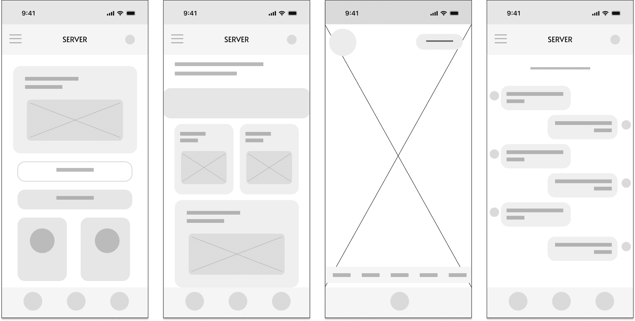
The Wireframes
The application available on the App store and compatible with both iOS & Android devices, allows players to track & make adjustments to their game live.
To create the interface of the application itself, I utilized Sketch to develop low-fidelity wireframes for the homepage, activity breakdown, lens, and chat.
I knew I wanted to use hues of both green and yellow to resemble both hard court & grass play. I eventually decided on more sage green and very faint yellow to represent the simplicity and beauty of the game.
I then worked on designing a series of backsplashes for the application that incorporated movement and noise to further emphasis the fluidity of the game itself.
Principles
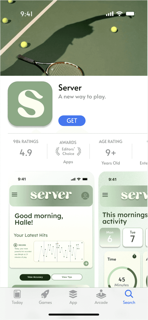

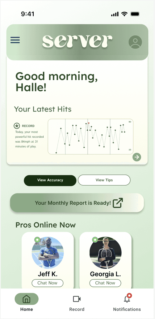
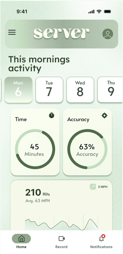
Server Application
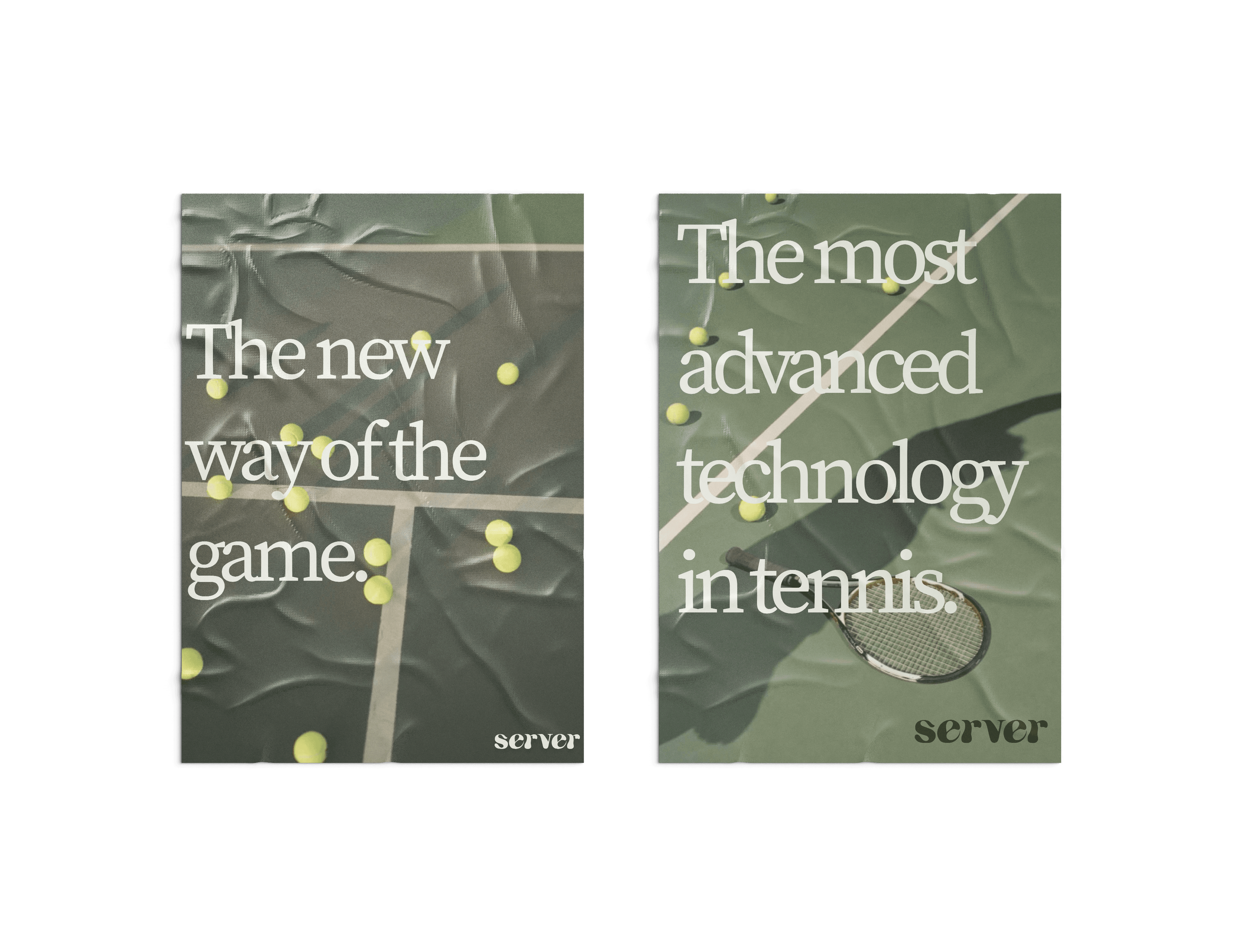
Print & OOH Strategy
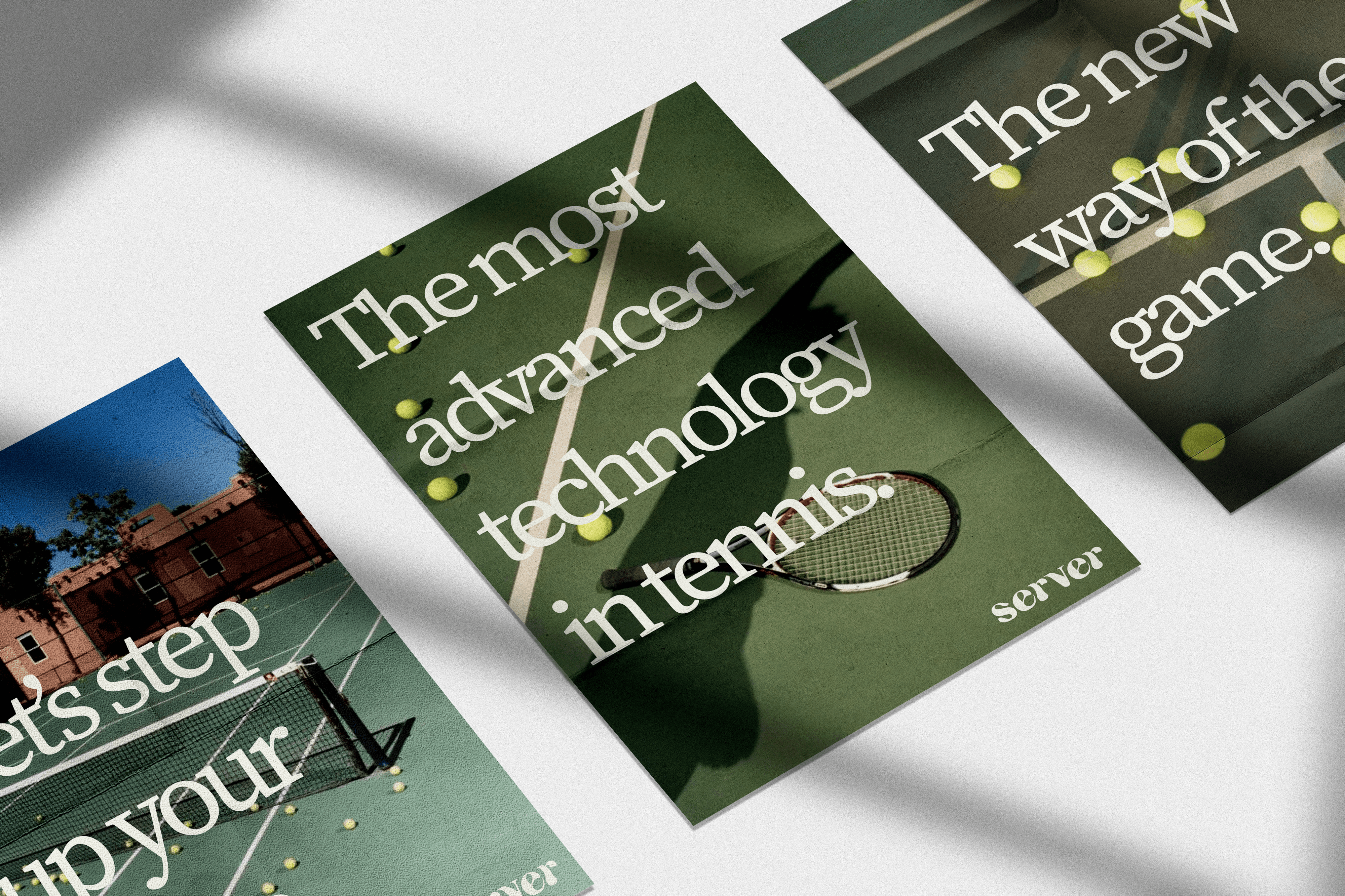
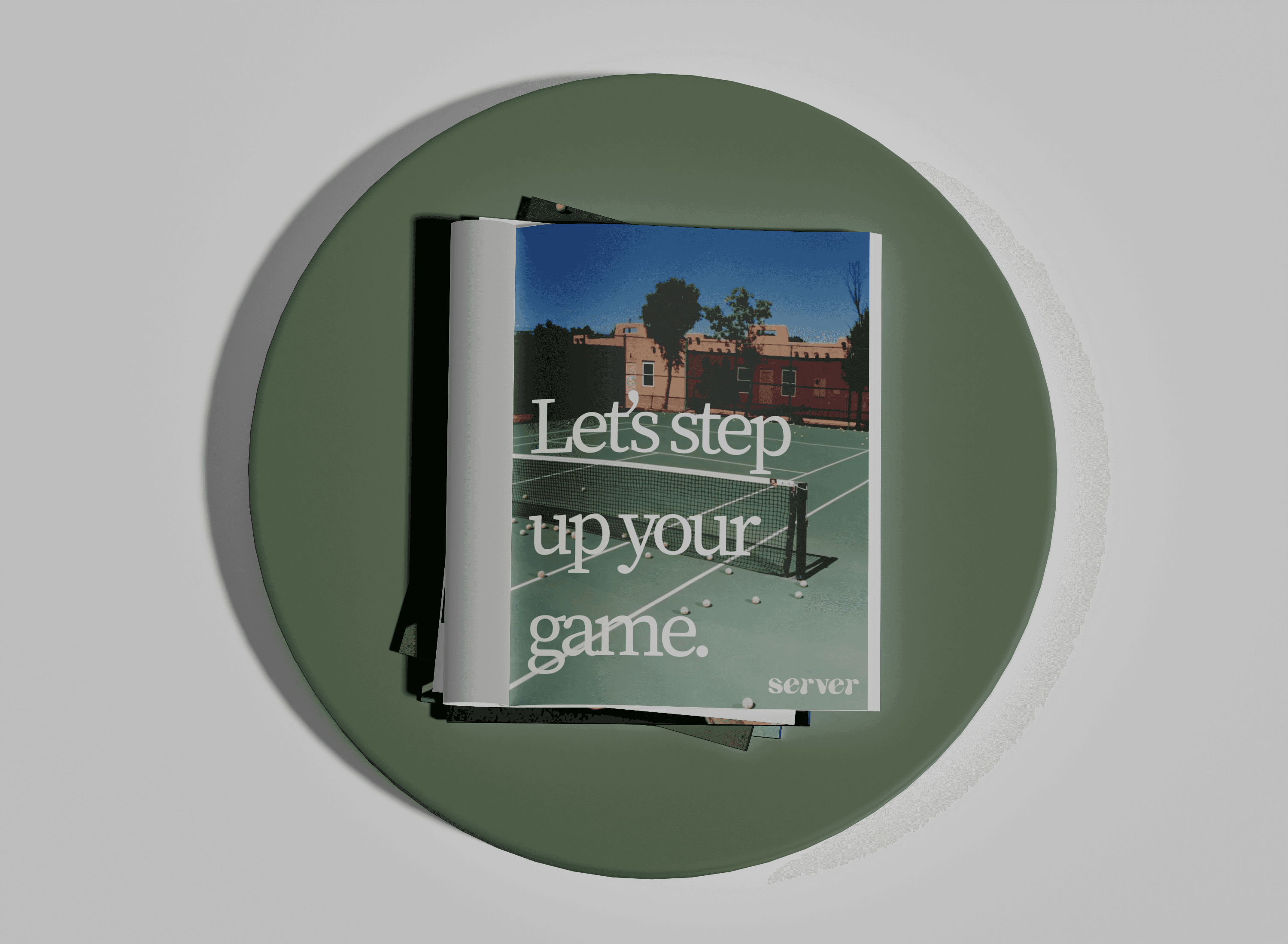
Targeting a variety of players, Server will be advertised through a variety of print & media formats. The posters will be glued in NYC neighborhoods such as the West Village, LES, UES, & Gramercy Park; home to most of the cities tennis communities and courts.
The print ads will focus on a few publications including Vogue, TeenVogue, GQ, and GoodHousekeeping.
The Design
The design of the advertisements is consistent with the overall branding of Server. With simple, vintage style images of tennis courts, with minimal players included. By taking the focus away from an image of a specific player, this emphasizes that the product is for everyone, regardless of appearance or skill level.
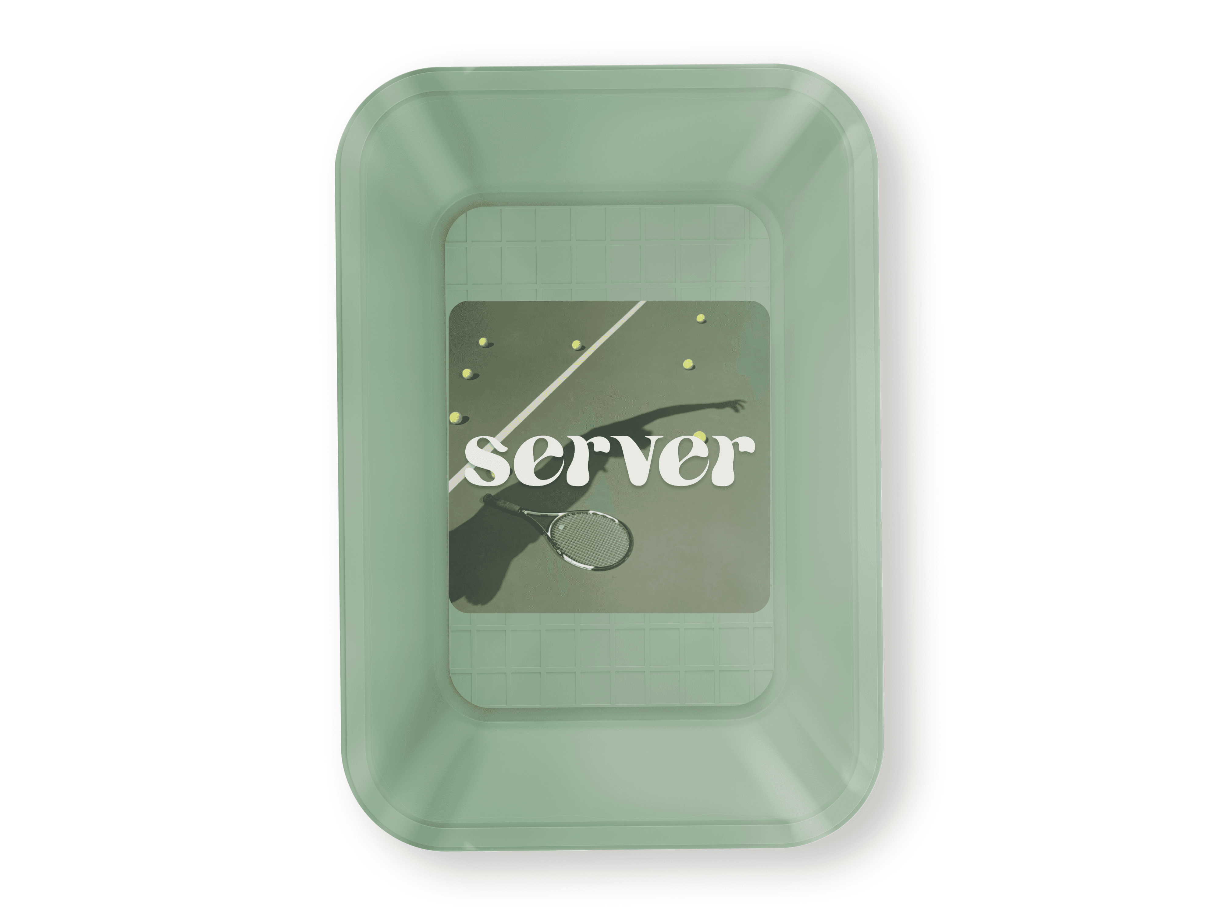
Packaging
The eco-friendly packaging of the product itself is compact and simple, minimizing waste. The overall design is clean, following Server's brand guidelines, and is ready for immediate use by any player.